Bring back the I-Block Logo

DaBirds17

New member
Joined
Sep 16, 2018
Messages
6
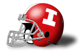
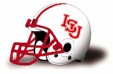
Hey y'all, think it is time we bring back the old I-State block logo. Many other schools have a letter thats simple and vintage thus giving a timeless classy look (Thinking of Alabama's A).
The State running vertical down the side of the capital I is the perfect touch. Would love to see a massive one in our center court. Looks so much better than just the I-Block of U of I. The words State running up and down really suits and completes it. Plus we used the block before U of I.

I also do not like the Redbird logo where it says Illinois State. Just should be a massive Redbird like our court now and Illinois State is implied. We shouldn't have to spell it out.

Lastly for home basketball jerseys we should have the front abrreivated with 'Birds embrace the nickname, thus the apostrophe implying Red. Many schools like Michigan State just put State on their jerseys.

I-State block is where it's at!
 

TheTruth

Well-known member
Joined
Jul 22, 2017
Messages
1,037
I don't see them going back to that because the "leadership" at Illinois State see the university as just another one of the regional schools rather than a statewide institution. At the rate they're going, I'd be less surprised to see them change the name to something like Central Illinois University to more aptly convey how they run the school. The reason for the words "Illinois State" in the redbird logo is that just about nobody outside of McLean County knows what that logo goes to. Having 1-AA football & marketing the university with the small-time mindset that they have has absolutely stifled the tremendous potential this athletic dept/university, has.
 

isuquinndog

Administrator
Staff member
Joined
Jul 16, 2017
Messages
7,289
Location
Redbird Country
Our friends to the east already have the block I thing so I don't think we would go to that.

I like your other ideas though.
 

SoCalRedbird

Active member
Joined
Jul 20, 2017
Messages
1,118
TheTruth said:
I don't see them going back to that because the "leadership" at Illinois State see the university as just another one of the regional schools rather than a statewide institution. At the rate they're going, I'd be less surprised to see them change the name to something like Central Illinois University to more aptly convey how they run the school. The reason for the words "Illinois State" in the redbird logo is that just about nobody outside of McLean County knows what that logo goes to. Having 1-AA football & marketing the university with the small-time mindset that they have has absolutely stifled the tremendous potential this athletic dept/university, has.
Exactly. Reminds me of our cringe-inducing marketing approach from back in the day.

"Your hometown team!"

If you were 65+ living in B-N, I'm sure that might tug at you a little. But for anyone outside of the 309 area code, it comes across as bush league podunkery. Pass.

Sent from my SM-G955U using Tapatalk


chuckie1980

Active member
Joined
Jul 17, 2017
Messages
2,169
I love Reggie and his look now. And love the "Reggie Redbird" cartoonish version from the kid's books.

If marketing needs to do anything for new promotions...create a Redbird drone and capitalize on it.

I Block?....never copy anything from down the road.
 

DaBirds17

New member
Joined
Sep 16, 2018
Messages
6
Thank you Truth and Socal Redbird. I was at a bar in Chicago and those of you who know just how Big 10 dominated many of the sports bars are there. I was wearing a shirt with the I-State Block logo and many people commented on how sharp they thought it looked. Many thought it was Iowa State at first and I had to explain to them that it was Illinois State. Later on wore it at a bar named Flagship, Chicago's Illinois State bar, and people raved which sparked me to make the post.

I like the Redbird head and Reggie but we do not need the Redbird head logo with Illinois State spelled it on it. The big Redbird head should symbolize Illinois State. We need to start thinking big. We are a premier mid-major we just have to utilize it.

Also regarding the I-State block logo. It is our retro logo. We are not a directional state school so with all due respect to U of I why do we have to de-emphasize our I-block logo since they switched from Chief Illiniwek.

I-State block logo was our historical logo too! Just because U of I is in the Big 10 we shouldn't have to give up our alternative logo I. It's classy, and simple get creative marketing department evolve from the late 90's early 00's.

The cartoonish version and drones should be in a different thread titled child's play. Don't say "never copy something down the road" when your lacking some major knowledge about our own historic logos.

Heres the link of our historic logos:
https://i.pinimg.com/originals/72/28/0b/72280bdbf879e90b38587b76e8c37901.jpg

Mockup of 'Birds jerseys to follow soon.
 

Hamdonger

Well-known member
Joined
Jul 17, 2017
Messages
6,500
DaBirds17 said:
(1)Many thought it was Iowa State at first and I had to explain to them that it was Illinois State.

(2)I like the Redbird head and Reggie but we do not need the Redbird head logo with Illinois State spelled it on it. The big Redbird head should symbolize Illinois State.

(3)Also regarding the I-State block logo. It is our retro logo.

1. You absolutely killed your argument with the t-shirt-in-bar statement. Exactly why we're not ready to go I-block...or even should go I-block.

2. Don't necessarily disagree, but then we're the Louisville Cardinals...or the AZ Cardinals...or...and revert back to #1. We're not ready.

3. I like the I-block logo alot. Alot. Too close to the other I-block neighbor logo. Not gonna work imo.

I'm not ripping you. Good ideas. But I DO like the Reggie and the Illinois State tag combined. imo that gives us much more name recognition than just our beloved Reggie head.
(*where's the picture of the color map with the school athletic logo highlighted from each state...believe it was the basketball forum highlighting the "highest ranked" bb program from each state)

I think our current logo with the Illinois State tag pops.
 

Hamdonger

Well-known member
Joined
Jul 17, 2017
Messages
6,500
DaBirds17 said:
The cartoonish version and drones should be in a different thread titled child's play. Don't say "never copy something down the road" when your lacking some major knowledge about our own historic logos.

You know not of whom you speak. Our luckiechuckie is well aware of the I-block logo. Most likely, he was watching I-block logo games before you were invented. Just sayin' :shifty:
 

chuckie1980

Active member
Joined
Jul 17, 2017
Messages
2,169
On facebook...ISU Redbird Softball Alumni Game prominently displayed a good look of the I Block during the Alumni Game. 30+ pics...and all looked great.

SO I concede....I Block is good...just don't change the current Reggie.... his image is definitely superior....
 

TIMMY

Well-known member
Joined
Jul 17, 2017
Messages
5,446
Location
1050 W Addison
Illinois_St_OLD5.gif
 
Top Bottom